31 May 2010
comdlg32.ocx problem
29 May 2010
Answering the Question: Will the Trend Reverse?
As you learned in the Continuation Patterns lesson, road trips are some of our favorite vacations. You jump in the car, head out on the open highway and soak in all of the scenery that you miss when you fly somewhere. Unfortunately, every road trip has to come to an end at some point, and you have to turn around and drive back home. Sometimes you turn straight around and head back immediately, but sometimes you delay heading home for just a little bit as you cruise around a little longer. But either way, you end up turning around.
Stocks turn around and end their road trips too. They run into support or resistance levels and eventually turn around and start moving back in the opposite direction. Sometimes they turn around immediately, and sometimes they test the support or resistance level in front of them a few times before finally giving up and turning around. Regardless, they eventually end up turning around.
If the stock you are watching really is at the end of its road trip and is ready to turn around and head home, a reversal pattern will most likely form while the stock price consolidates. Reversal patterns tell you that the stock is going to turn around and reverse its previous trend after it breaks out of the reversal pattern.
Check out the Reversal Patterns video that goes with this article.
Reversal patterns, like all price patterns, are made of the following four pieces:
- Old trend: the trend that the stock price is in as it starts to form the price pattern
- Consolidation zone: a constrained area defined by set support and resistance levels
- Breakout point: the point at which the stock price breaks out of the consolidation zone
- New trend: a reversal of the old trend that the stock price enters as it comes out of the consolidation zone

Reversal patterns form in a few different shapes, but for the most part, they look quite similar. The only real difference you will see is in the shape of the consolidation zone. The consolidation zones of some reversal patterns have a single level of support and single level of resistance while others have multiple levels of support and multiple levels of resistance. Every other aspect of the price pattern is identical.
The following are the most common reversal patterns you will see during an uptrend:
- Double tops
- Triple tops
- Head-and-Shoulders tops
Double tops---double tops form during an uptrend as the up-trending stock price hits the same resistance level twice in the consolidation zone.
Triple tops---triple tops form during an uptrend as the up-trending stock price hits the same resistance level three times in the consolidation zone.
Head-and-Shoulders tops---head-and-shoulders tops form during an uptrend as the up-trending stock price hits a lower resistance level, then hits a higher resistance level and then hits the lower resistance level a second time in the consolidation zone.
The following are the most common reversal patterns you will see during a downtrend:
- Double bottoms
- Triple bottoms
- Head-and-Shoulders bottoms
Double bottoms---double bottoms form during a downtrend as the down-trending stock price hits the same support level twice in the consolidation zone.
Triple bottoms---triple bottoms form during a downtrend as the down-trending stock price hits the same support level three times in the consolidation zone.
Head-and-Shoulders bottoms---head-and-shoulders bottoms form during a downtrend as the down-trending stock price hits a higher support level, then hits a lower support level and then hits the higher support level a second time in the consolidation zone.
28 May 2010
ADX Indicator
How To Use The ADX Indicator
The ADX indicator measures the strength of a trend and can be useful to determine if a trend is strong or weak. High readings indicate a strong trend and low readings indicate a weak trend.
When this indicator is showing a low reading then a trading range is likely to develop. Avoid stocks with low readings! You want to be in stocks that have high readings.
This indicator stands for Average Directional Index. On some charting packages there are two other lines on the chart, +DI and –DI (the DI part stands for Directional Indicator). Ignore these lines. Trying to trade according to these two lines is a great way to lose money!
The only thing that we are concerned with is the ADX itself.
Note: This indicator measures strong or weak trends. This can be either a strong uptrend or a strong downtrend. It does not tell you if the trend is up or down, it just tells you how strong the current trend is!
Let’s look at a chart:

In the chart above, the ADX indicator is the thick black line. The green and the red lines are the +DI and –DI (ignore these). The highlighted areas show how this indicator identifies trading ranges. ADX is showing a low reading and the stock is chopping around sideways.
Now look at what happens when the indicator gets into higher territory. A strong trend develops! These are the type of stocks that you want to trade.
On the right side of the indicator panel you will see a scale from 0 to 100 (only 10 through 50 are marked). Here are my guidelines for using the scale:
ADX Indicator Scale
If ADX is between 0 and 25 then the stock is in a trading range. It is likely just chopping around sideways. Avoid these weak, pathetic stocks!
Once ADX gets above 25 then you will begin to see the beginning of a trend. Big moves (up or down) tend to happen when ADX is right around this number.
When the ADX indicator gets above 30 then you are staring at a stock that is in a strong trend! These are the stocks that you want to be trading!
You won’t see very many stocks with the ADX above 50. Once it gets that high, you start to see trends coming to an end and trading ranges developing again.
Tips
The only thing I use the ADX for is an additional filter in my scans, so that I can find stocks that are in strong trends. I do not even have the ADX indicator on the charts that I look at when I am looking for setups. Since the ADX is already factored into the scans, I don't need it added to the chart itself.
I don't pay any attention to the rising and falling of the ADX indicator. Stocks can go up for long periods of time even though the ADX may be falling (indicating that the trend is getting weak). The ideal scenario is that the ADX is rising, but I don't find it necessary to take a trade.
I don't use any technical indicators on my charts. I found out that technical indicators just clouded my judgement. One technical indicator may indicate a buy and one may indicate a sell. Needless to say, this can be very confusing and it just takes you attention away from the only thing that matters - PRICE.
So what is the ADX indicator good for?
This indicator is best used for screening stocks and writing scans. By adding this indicator to your scanning software, you can eliminate all of the stocks that are in trading ranges. You can then set up your scan to find only those stocks that are in strong uptrends or strong downtrends.
The ADX indicator does not give buy or sell signals. It does, however, give you some perspective on where the stock is in the trend. Low readings and you have a trading range or the beginning of a trend. Extremely high readings tell you that the trend will likely come to an end.
Swing Trading Gaps
How to trade gaps on a stock chart
Are all gaps created equal? Nope. There are really only two significant factors to consider when trading gaps.
You have to be able to identify if the gap is caused by professional traders or amateur traders. There is a big difference between the two!
Wait a minute...let's back up a second...
What is a gap?
A gap is defined as a price level on a chart where no trading occurred. These can occur in all time frames but, for swing trading, we are mostly concerned with the daily chart.
A gap on a daily chart happens when the stock closes at one price but opens the following day at a different price. Why would this happen? This happens because buy or sell orders are placed before the open that cause the price to open higher or lower than the previous day's close.
Here is an example:
Let's say that on Tuesday, Microsoft closes at $26.57. After the close they come out with their earnings report. They report higher than expect earnings that causes excitement among investors. Buy orders come flooding in. The next day Microsoft opens at $27.60. Since there were no trades between $26.57 and $27.60 this will create a gap on the chart.
Let's look at a chart:

You can see on the chart above that the stock closed at one price and then the next day the stock "gapped up" creating a price void on the chart (yellow circle).
Filling The Gap
In Japanese Candlestick Charting gaps are referred to as windows. When we say that a stock is "filling a gap", the Japanese would say that the stock is "closing the window".
Sometimes you will hear traders say that a stock is "filling a gap" or they might say that a stock has "a gap to fill".
Are you wondering what the heck they are talking about?
They are talking about a stock that has traded at the price level of a previous gap. Here is a chart example:

In this example, you can see that the stock gapped down. A few days later it rallied back up and filled in the price level at which there were previously no trades. This is known as filling the gap.
Sometimes you will hear traders saying that "gaps always get filled". This just simply isn't true. Some gaps never get filled, and sometimes it can take years to fill a gap. So I really don't even think it is worth debating because it offer no edge one way or another!
Types Of Gaps
Traders have labeled gaps depending on where it shows up on a chart. It isn't really necessary to memorize all of these patterns but here is the breakdown so that you can impress your trading friends.
- Breakaway Gaps - This type usually occurs after a consolidation or some other price pattern. A stock will be trading sideways and then all of sudden it will "gap away" from the price pattern.
- Continuation Gaps - Sometimes called runaway gaps or measuring gaps, these occur during a strong advance in price.
- Exhaustion Gaps - This type of gap occurs in the direction of the prevailing trend and represents the final surge of buying or selling interest before a major trend change.
Ok, now we are going to get into the really good stuff...
Professional vs. Amateur Gaps
When you are looking at gaps on a stock chart, the most important thing that you want to know is this:
Was this gap caused by the amateur traders buying or selling based on emotion?
Or...
Was this gap caused by the professional traders that do not make emotional decisions?
To figure this out you have to understand this one important concept first. Professional traders buy after a wave of selling has occurred. They sell after a wave of buying has occurred.
Amateur traders do the exact opposite! They see a stock advancing in price and are afraid that they will miss out on the move, so they pile in - just when the pro's are getting ready to sell.
Here is an example of a gap caused by amateur traders...

See how this stock gapped up after a wave of buying occurred? These amateur traders got emotionally involved in the stock. They piled in after an already extended move to the upside.
These traders eventually lost money as the stock sold off over the next few weeks. Notice how the stock eventually did go back up - but only after a wave of selling occurred (professional buying).
Here is another chart:

See how this stock gapped down after a wave of selling occurred? These amateur traders got emotionally involved in the stock. They sold after an already extended move to the downside.
Ok, so let's break this down, shall we?
- If a stock gaps up after a wave of buying has already occurred, these are amateurs buying the stock - look to short.
- If a stock gaps down after a wave of selling has already occurred, these are amateurs selling the stock - look to go long.
These types of gap plays usually provide great opportunities because they represent and extreme price move.
Well, there you have it...a short primer on trading gaps.
Gaps can provide nice swing trading profits but they can be a little more tricky to trade. The advantage is that you can sometimes make big profits, quickly, and with a little less risk...
...something every trader should strive for.
Trading Multiple Time Frames
How to Read Charts Through Different Time Periods
Looking at multiple time frames can give you a better idea of what is happening with a stock. For swing trading, we can break this down into 4 time periods: The daily, weekly, 60 minute, and 5 minute time frames.
Looking at a stock through different time frames can be confusing if you are a new trader. Why? Because each time frame looks different! A stock may look great on the daily chart, but look horrible on a 5 minute chart.
I am going to try and simply it on this page but if looking at all these multiple time frames is confusing the heck out of you, then STOP. Just stick with the daily chart and the hourly (60 minute) chart. You'll do just fine.
The Daily Chart: Your Main Charting Workspace
This is where you will spend the majority of your time as a swing trader. When you run your scans, you are running them off of the daily chart. This is where you will seek to find trading opportunities.
Your daily chart should go back 5 to 7 months or longer. You want it to show enough data so that you can find support and resistance points. Remember that each candle represents one day of trading.
Here is an example using QQQQ.

Obviously, your chart will be much bigger than this. Make it fill up your entire screen. The bigger the better.
You still would like to get an idea what the longer term trend looks like. This is where the weekly chart comes in.
The Weekly Chart: Birds Eye View
Think of the weekly chart as the time frame that allows you to step back and get a look at the longer term trend. You can only fit so much data on the daily chart so it is hard to see what is really going on with a stock.
On the weekly chart, you want to see that the stock is in an uptrend and if there are any significant chart patterns. Many investors and institutional traders use this time frame to make buy and sell decisions. So ask yourself, "If I were them, would I want to buy the stock now?"
Here is an example using the same chart (QQQQ):

We can see from this time frame that QQQQ has formed a double bottom! We couldn't see that on the daily chart because there wasn't enough data. But, by looking at the weekly chart, we may be quite a bit more bullish now that we know that it has formed this pattern.
In this time frame, you can go back two or three years (each candle represents one week of trading). There really isn't any reason to go back further than that for swing trading. And, you don't need to spend a whole lot of time in this time frame.
After all, you are a swing trader that only holds a stock typically for a few days.
The 60 Minute Chart: Binocular View
Think of the 60 minute chart (hourly) like you were getting out of pair of binoculars and analyzing what is going on with the individual candles on the daily chart. When you buy pullbacks off the daily with consecutive lower highs (long positions), you will see that the stock is in a downtrend on the 60 minute chart.
You are looking for a break of that trend line in this time frame.
When you say, "I'll buy when the stock trades over the previous high.", what you are really doing is buying that trend line break on the 60 minute chart.
Here is an example using QQQQ again:

Your hourly chart should go back 15 to 20 days (each candle represents one hour of trading). You can see that by analyzing this time frame, it is easier to see (and possibly anticipate) a trend line break. And sometimes, you will see a stock bottoming out in this time frame that may not notice on the daily chart. After Now it is time for your entry...
The 5 Minute Chart: Microscope View
This is where we will get our entry. So far, we have found a great setup on the daily chart. We checked the weekly for chart patterns and to make sure that the stock is in an uptrend. We zoomed in using the 60 minute chart and watched for a break of that trend line.
We have already made our decision that we are going to buy the stock.
The five minute time frame is used to buy the stock at the best possible price. You really don't need to spend a whole lot of time analyzing this chart. Just look for the stock pull back to a support area (on the long side) to get your entry price. Simple.

You only need to look at the 5 minute chart with the current days data (each candle represents five minutes of trading).
There is one other time frame that I should mention. That is the 15 minute chart. Why would you look at this time frame? Because sometimes, the day traders will make the 5 minute chart look sloppy! Using the 15 minute chart can smooth out the whipsaws that show up on the 5 minute chart.
You may even decide to use the 15 minute chart instead of the 5 minute chart.
Trading Tips
- Each time frame affects the other. A news event affects the intra day (5 minute) chart. This affects the hourly chart, which affects the daily chart, which affects the weekly chart.
- You may be able get a better entry with a tighter stop loss order using the 60 minute chart rather than the daily chart.
- Use the 200 SMA in all time frames - even on intra day charts. You'll be suprise to see how stocks react when they get close to this moving average!
Analyzing different multiple time frames can improve your success as a swing trader. However, you will rarely find a stock the looks absolutely perfect on the weekly, daily, and intra day charts. Your main goal is to identify support and resistance areas that could affect the stock in that time frame.
The important thing to remember is to pick your main time period then look at a time frame above it and a time frame below it. The lower time frame tells you what is happening now and the higher time frame tells you what could happen in the future.
Shorting Stocks
Learn How To Short Stocks
To short a stock you are betting that the value of a stock will go down. Shorting stocks is the act of selling something that you do not own. In order to do this you have to borrow the shares of stock from your broker. But I'm getting ahead of myself. First, let's talk about what shorting stocks entails.
What is shorting stocks?
When you short a stock, you will borrow the shares from your broker, wait until the price drops, buy the shares, then return the borrowed shares back and you will profit the difference. Here is an example:
Microsoft is trading at $30.00 a share. You think that the price is going to go down so you short 200 shares ($6000.00). You are borrowing shares of Microsoft from your broker at this high price of $30.00. Just as you expected Microsoft goes down to $20.00 a share.
You decide that you are ready to cash in, so you buy (called covering) the shares at $20.00. Your broker will now return the borrowed shares to the owner and you will profit the difference. Since you shorted at $30.00 and covered at $20.00 your profit is $10.00 a share on 200 shares - $2000.00.
If this all sounds confusing, imagine this scenario:
You buy a new plasma TV for $4000.00 and invite me over to see it. You say that you have to leave for the day and that I can continue to watch it. While you are gone, I see a commercial for the exact TV that has just gone on sale for $3500.00 - at the same place that you bought it!
So what do I do? I pack up your TV, grab your receipt, and take it to the store. I pretend that I am you and complain. The store manager gives me the difference between the price you paid and the sale price - $500.00. I return the TV to your house, pocket the $500.00, and you never knew what happened!
It is the same thing with shorting stocks.
From a traders perspective, all of this happens behind the scenes. You just simply log on to your account and click the sell (or short) button and you have just shorted the stock. When you are ready to cover, you click the buy (or cover) button and your done.
Pretty simple right? Not so fast.
There are some things you need to be aware of...
- You must have a margin account to be able to short stocks.
- Your online broker may not have enough shares available for you to short.
- If the stock pays a dividend while you are short, YOU will be liable.
Is shorting stocks ethical?
Some people claim that shorting stocks is un-ethical because they are contributing to the stock price going down. This is bogus! Remember that after you short a stock, you then have to buy it back! This creates buying pressure on the stock.
Short sellers slow the rapid decline of a stock by buying to cover on the way down. If the short sellers were not involved in the stock, it could plummet! Also, short sellers can be caught in a "short squeeze".
What's a short squeeze?
This happens with a stock that has heavy short interest. Let's say that a lot of traders are short a particular stock. If the stock begins to rise rapidly, then short sellers will get nervous and want to buy (cover). This could add significant buying pressure to the stock, encourage new long positions, and make the stock explode!
There is nothing wrong with shorting. It's just part of the everyday workings of the stock market.
Should I short stocks?
I think it is almost essential that a swing trader learn to short stocks. Buying stocks is only half of the equation! If the market in general is in a downtrend, you are not going to want to be buying stocks. So in order to make any money you need to learn the art of shorting.
Learning to short stocks will also help you to better understand where reversals will take place. By shorting stocks yourself, you will be able to gauge where other traders are going to short stocks and cover their positions.
Sometimes you can make money faster by shorting than by buying. Why? Because stocks typically go down at a faster rate, then when they go up! Fear is a much more powerful emotion than greed.
The general public only plays the long side of the market. They do not realize that you can make money when stocks go down. They think that if a stock goes up, then this is "good". If a stock goes down, then this is "bad".
Wrong! It depends on which side (long or short) of the market you are on.
I think Wall Street really doesn't want the public to know about shorting stocks. In a bear market, the professionals on TV talk about how "horrible" the market is to encourage investors to sell.
They are shorting stocks and profiting all the way down.
How to Short Stocks
When you short a stock, instead of waiting for a pullback, you are looking for a rally into the Traders Action Zone.
Take a look at the following chart:

You can see that the 10 period moving average is below the 30 period moving average. Also, the stock is trading below the 200 period moving average.
This stock has rallied up into the TAZ and formed a swing point high which is part of our normal entry strategy. That is where you will want to sell short this stock. So you are really just trading the opposite of how you would trade long positions.
That's it! Once you begin to short stocks, you will begin to get more comfortable with it. It won't make any difference to you whether we are in a bull market or a bear market.
You can now make money regardless of direction!
Fibonacci Retracements
How To Use Fibonacci Retracements (with video)
The Fibonacci retracements pattern can be useful for swing traders to identify reversals on a stock chart. On this page we will look at the Fibonacci sequence and show some examples of how you can identify this pattern.
Fibonacci numbers were developed by Leonardo Fibonacci and it is simply a series of numbers that when you add the previous two numbers you come up with the next number in the sequence. Here is an example:
1, 2, 3, 5, 8, 13, 21, 34, 55
See how when you add 1 and 2 you get 3? Now add 2 and 3 and you get 5, and so on. So how does this sequence help you as a swing trader?
Well, the relationship between these numbers is what gives us the common Fibonacci retracements pattern in technical analysis.
Fibonacci Retracements Pattern
Stocks will often pull back or retrace a percentage of the previous move before reversing. These Fibonacci retracements often occur at three levels – 38.2%, 50%, and 61.8%. Actually, the 50% level really does not have anything to do with Fibonacci, but traders use this level because of the tendency of stocks to reverse after retracing half of the previous move. Here is an example using a graphic explaining the retracement pattern…

This picture shows a graphical representation of the reversal points for stocks in an uptrend. The pattern is reversed for stocks that are in downtrends.
After a stock makes a move to the upside (A), it can then retrace a part of that move (B), before moving on again in the desired direction (C). These retracements or pullbacks are what you as a swing trader want to watch for when initiating long or short positions.
Once the stock begins to pull back (retrace), then you can plot these retracement levels on a chart to look for signs of a reversal. You do not automatically buy the stock just because it is at a common retracement level! Wait, and look for candlestick patterns to develop at the 38.2% area. If you do not see any signs of a reversal, then it may go down to the 50% area. Look for a reversal there. You do not know if or when the stock will reverse at a Fibonacci level! You just mark these areas on a chart and wait for signal to go long or short.
How To Draw A Fib Grid
So how do we identify Fibonacci patterns on a chart. Easy, we draw a Fibonacci grid (fib grid) using swing points. Here is an example:

Draw the fib grid from the swing point high and the swing point low of a swing. Your charting software should come with this feature. It is a standard option on most charting packages. If not, you can calculate it manually by using this formula:
Calculate the range from the swing point high to the swing point low.
Now multiply the range times a Fibonacci ratio – 38.2% (0.382), 50% (0.500), and 61.8% (0.618).
Finally, subtract that number from the swing point high. That will give you your Fibonacci levels.
This chart shows an actual trade that I made. ARI pulled back into the TAZ and then formed a hammer right at the 50% level. That gave me the signal to go long. Nice trade!
Video Tutorial
Here is a short video that will better explain these retracement levels and how to tell if a stock is strong or weak. Click the play button on the chart to begin...
Find more videos like this on ChartWatchers
Is It Useful?
Well…maybe…sometimes…
Most of the time, when you draw a fib grid on a chart, you will notice that the grid lines up with support and resistance areas that you would see anyway without drawing the lines in! So you really do not need to draw the lines in. Instead, you can just look at a chart and estimate where the levels are.
Look again at the chart above of ARI. If you didn't draw the Fibonacci retracement lines in, you can still tell just by looking at the chart that the stock has retraced 50% of the previous move.
If drawing the lines in helps you to better visualize the fib levels, then by all means use it! The choice is up to you.
Fibonacci Software
You may be interested in getting this Fibonacci software. This software is really easy to use. Just enter a high and a low price and it will plot the price levels for you.
What is unique about this software is that it also gives you Fibonacci time levels. Yep, that's right. On this page we talked about price levels, but stocks can also reverse at certain time intervals.
This software will give you future dates where stocks (or the market) can reverse. Then you look for both price and time to match. This can pinpoint some powerful reversals.
Fibonacci E-book
Also, if you want to get into some really advanced Fibonacci analysis, then you may want to check out this Fibonacci e-book. It was written by Wayne Gorman who has 25 years experience in trading, forecasting, and portfolio management. He also worked for Citibank and Westpac Banking Corporation.
This 90 page e-book goes into detail on Fibonacci time relationships, retracements, extensions, clusters, etc. There is also a big emphasis on Elliott Wave theory in this e-book. Some of it can get complicated but you'll definitely be an expert on Fibonacci by the time you finish reading this!
So there you have it. Hopefully, this page gave you a good idea of how Fibonacci works. At least now you can start plotting fib grids and looking at retracement levels the next time you consider a trade.
Just remember...
Price is king. Wait for signs of a reversal before you initiate a trade!
Stock Scans
How To Scan For Stocks
Stock scans are easy to write and absolutely essential to swing trading. You need to be able to find stocks with the exact setup that you are looking for. For day trading and swing trading, you have to be able to run scans!
So, on this page, I have compiled a list of some of the best charting and scanning services on the net. By going through this list, you can make an informed decision and pick the one that is right for you.
MarketClub

This scanning and charting solution is unique from anything else on the net. You don't actually write scans. Instead, it scans the market for you based on their "Trade Triangle and Smart Scan" technology. It then identifies on a chart when to go long or short.
It has a nice charting platform with multiple indicators, ability to draw trend lines, Fibonacci retracemets, etc. Really, this service is a charting, scanning, and trading system all in one. Read my review of Market Club.
StockCharts.com

StockCharts.com definitely has the best looking charts on the net. No doubt about it. They also have a fast and powerful scanning engine. You can use their pre-defined scans or create your own from scratch.
You won't get a lot of bells and whistles with StockCharts.com. If that is what you are looking for, then you will be disappointed. If you want a simple charting and scanning solution, then you will be pleased with their service. Learn about scanning using StockCharts.com.
StockFetcher

StockFetcher has released it's 2.0 version of its standard screening and charting interface. It sports a nice clean charting platform with scanning capabilities. No software to download.
The first thing I noticed right away is how fast it scans for your specified criteria. Nice! It also has some useful annotation features and chart themes. Learn more about StockFetcher here.
TeleChart

This is a popular software program among traders. It has so many features that it would take forever to list. You can create your own scans, watch lists, get access to proprietary technical indicators, and view streaming real time charts.
The unique thing about TeleChart is that it "automatically maintains a highly-indexed, massive stock market data bank locally on your hard drive". This makes scanning for stocks a lot faster than getting the data from a website. Check out TeleChart.
Amibroker

AmiBroker is a comprehensive technical analysis program, allowing you to study and predict trends in the market and to maintain a portfolio of shares. It incorporates a powerful set of technical analysis tools, OLE Automation/ARexx interface with rich command set and several options for quotation data import.
The great thing about Amibroker is you only have to pay a one time fee for the software. It also offers bactesting, screening, and charting features. Amibroker.
Trade Ideas

Trade Ideas is a real time streaming stock alerts and scanner. With this service, you will get real time streaming alerts on a tick by tick basis to find intraday trading opportunities.
Although is service is mostly for day traders, there are some useful free scans that you can run off of the daily chart. These include: volatility, moving averages, consecutive up/down days, and consolidations. Trade Ideas
ChartFilter

ChartFilter is one of the largest free technical analysis websites on the net. With a simple sign up process, you get a customizable stock screener, screening strategies, and technical charting.
Stock Tools 3.0 is a downloadable program that gives you advanced charting features, stock alerts, and a portfolio manager. You will also get access to numerous technical analysis articles and information. Chart Filter
Equity Feed

Are you a day trader? If so, then you may want to check out Equity Feed. You can filter the stock market, look at charts, get trading alerts, and news - in real time.
The nice thing about Equity Feed is how clean and simple the interface is. You won't find a lot of clutter like other similar products. Check out the video tutorials to see if it is right for you. Equity Feed
Finviz

Finviz has a free stock screener and lists stocks with common chart patterns including triangles, double bottoms, and head and shoulders. They also have free stock charts and news feed.
There is quite a bit of free content on this website but they do offer an Elite version that gives you access to real time quotes, advanced charting, email alerts, and back testing. You definitely want to check out this website. Finviz
Which one is right for me?
It would be impossible for me to tell you. It all depends on your personal preference and the type of trader that you are. My best advice? All of these scanning and charting services offer free trials. Sign up for one and try it out.
Then you will be able to make the best decision.
Candlestick Patterns
10 Best Candlestick Patterns
There are many candlestick patterns but only a few are actually worth knowing. Here are 10 candlestick patterns worth looking for.
Remember that these patterns are only useful when you understand what is happening in each pattern.
They must be combined with other forms of technical analysis to really be useful. For example, when you see one of these patterns on the daily chart, move down to the hourly chart. Does the hourly chart agree with your expectations on the daily chart? If so, then the odds of a reversal increase.
The following patterns are divided into two parts: Bullish patterns and bearish patterns. These are reversal patterns that show up after a pullback (bullish patterns) or a rally (bearish patterns).
Bullish Candlestick Patterns

Engulfing: This is my all time favorite candlestick pattern. This pattern consists of two candles. The first day is a narrow range candle that closes down for the day. The sellers are still in control of the stock but because it is a narrow range candle and volatility is low, the sellers are not very aggressive. The second day is a wide range candle that “engulfs” the body of the first candle and closes near the top of the range. The buyers have overwhelmed the sellers (demand is greater than supply). Buyers are ready to take control of this stock!
Hammer: As discussed on the previous page, the stock opened, then at some point the sellers took control of the stock and pushed it lower. By the end of the day, the buyers won and had enough strength to close the stock at the top of the range. Hammers can develop after a cluster of stop loss orders are hit. That’s when professional traders come in to grab shares at a lower price.
Harami: When you see this pattern the first thing that comes to mind is that the momentum preceding it has stopped. On the first day you see a wide range candle that closes near the bottom of the range. The sellers are still in control of this stock. Then on the second day, there is only a narrow range candle that closes up for the day. Note: Do not confuse this pattern with the engulfing pattern. The candles are opposite!
Piercing: This is also a two-candle reversal pattern where on the first day you see a wide range candle that closes near the bottom of the range. The sellers are in control. On the second day you see a wide range candle that has to close at least halfway into the prior candle. Those that shorted the stock on first day are now sitting at a loss on the rally that happens on the second day. This can set up a powerful reversal.
Doji: The doji is probably the most popular candlestick pattern. The stock opens up and goes nowhere throughout the day and closes right at or near the opening price. Quite simply, it represents indecision and causes traders to question the current trend. This can often trigger reversals in the opposite direction.
Bearish Candlestick Patterns

You’ll notice that all of these bearish patterns are the opposite of the bullish patterns. These patterns come after a rally and signify a possible reversal just like the bullish patterns.
Ok, now it’s your turn! I’ll let you figure out what is happening in each of the patterns above to cause these to be considered bearish. Look at each candle and try to get into the minds of the traders involved in the candle.
Kickers
There is one more pattern worthy of mention. A "kicker" is sometimes referred to as the most powerful candlestick pattern of all.
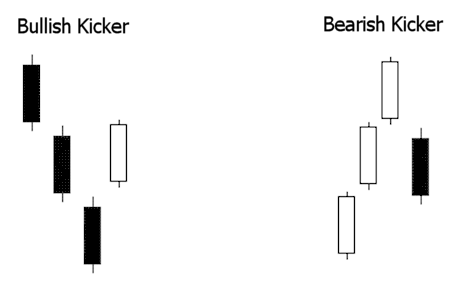
You can see in the above graphic why this pattern is so explosive. Like most candle patterns there is a bullish and bearish version. In the bullish version, the stock is moving down and the last red candle closes at the bottom of the range.
Then, on the next day, the stock gaps open above the previous days high and close. This "shock event" forces short sellers to cover and brings in new traders on the long side.
This is reversed in the bearish version.
Confirmation?
Most traders are taught to "wait for confirmation" with candlestick patterns. This means that they are supposed to wait until the following day to see if the stock reverses afterward. This is absolutely ridiculous!
I ain’t waitin’ for no stinkin’ confirmation!
How’s that for good grammar! Seriously, think about it for a second. If a stock pulls back to an area of demand (support) and I have a candlestick pattern that is telling me that buyers are taking control of the stock, then that is all the confirmation I need.
As a swing trader I have to get in before the crowd piles in, not when they get in! In other words, I want to be one of the traders that make up the pattern itself! That is the low risk, high odds play.
Just the way I like it.
Find support and resistance on a chart
Find support and resistance on a chart
Support and resistance identify areas of supply and demand. But what exactly is supply and demand?
Supply is an area on a chart where sellers are likely going to overwhelm buyers causing the stock to go down. On a chart, we call this resistance.
Demand is an area on a chart where buyers are likely going to overwhelm sellers causing the stock to go up. On a chart, we call this support.
Knowing this, it only makes sense to buy at support and sell at resistance!
Stocks run into resistance (supply) because those traders that bought too late and saw the price go down now want to get out at break even so they sell. Stocks find support (demand) because those traders that missed the move up now have a second chance to get in so they buy.
The picture below shows support and resistance and the laws of supply and demand.

Support can become resistance and resistance can become support if prices break through these areas. Here is an example:

In the picture above you can see that once prices fell through support (1) it became resistance (2) and once prices broke through resistance (3) it became support (4).
Ok, you probably already knew all that but here is something that most traders do not know. There are varying degrees of support and resistance.
On the long side, when a stock falls down to a prior low it is more significant than when a stock falls down to a prior high.
On the short side, when a stock rises up to a prior high it is more significant that when a stocks rises up to a prior low.
In other words, the more times a support or resistance area is "hit", the more significant it is. In the first picture above, the support and resistance areas are very significant, whereas in the second picture these areas are only somewhat significant.
Enough rambling, let’s look at some charts...

The chart above shows how stocks run into resistance. But look at the areas that I highlighted in yellow. What are these traders doing buying stocks that are running up into an area of supply (resistance)?
Now, look at the chart below:

The chart above shows how stocks find support. But look at the areas that I highlighted in yellow. What are these traders doing selling stocks that are going down into an area of demand (support)?
They do that because they are novice traders. They always buy after significant buying has already taken place into areas of resistance, and they always sell after significant selling has already taken place into areas of support. YOUR JOB AS A SWING TRADER IS TO IDENTIFY THE NOVICE TRADERS BECAUSE THOSE TRADERS ARE THE ONES YOU WILL PROFIT FROM.
But wait! There are other forms of support and resistance that are not so common. For example, look for stocks that pull back and find support halfway into a prior wide range candle. Like this:

Or, look for stocks to pull back and find support halfway into a gap...

The bottom line is that you want to be buying stocks where buyers will likely come into the stock. You want to be selling stocks where sellers will likely come into the stock. Don't follow the novice traders!
How To Read Stock Charts
Learn how to read stock charts
Reading charts is an art form that can take years to fully master. Why do we read charts? Because, by reading charts, we can determine what the "big money" is doing!
You have to be able to analyze a chart and come to a conclusion about whether or not to risk your hard earned money on a trade.
That is really the bottom line.
And this is what separates the novice trader from the professional. There are several factors on a chart that make it worthy of trading. By analyzing these factors, we can determine with high probability which direction a stock will move.
There several questions that you want to ask yourself when you look at a stock chart. Here they are...
- What stage is this stock in?
- Is this stock in and uptrend or a downtrend?
- Is the stock at the beginning, middle, or end of the trend?
- How strong is the trend?
- Where are the trend lines?
- What wave is this stock in?
- What do the moving averages tell me?
- Was there a breakout recently?
- Is the chart "smooth" or "sloppy"?
- Are there any chart patterns?
- Are there wide range candles in the direction of the trend?
- Are there any gaps in the direction of the trend?
- Are professionals selling strength or buying weakness?
- Where are the support and resistance areas?
- Is this stock at a Fibonacci level?
- What does volume tell me?
I know it seems like a lot of information to try and keep track of but all of the above questions are essential to chart reading mastery! Now, copy and print out that list of questions and keep it handy next to your computer. Make several copies so that you can check off and make notes as you analyze your next chart.
Go ahead, I'll wait...
Got it printed out? Great! Now you won't forget anything important when it's time to analyze a chart for your next trade. In the heat of battle, when emotions are running high, it is very easy to forget to look for some of the most basic things on a chart. I've done it. That is, until I made this list!
Ok, now let's go through the list one by one to make sure that you know how to answer the questions correctly. Don't worry, with practice, you will not even need to think about these things. It will become automatic.
You will be able to read charts with lightning fast speed. In just a couple of seconds you will be able to glance at a chart and know all the answers to the questions above.
Stages, Trends, and Waves
Let's look at an example chart...

Nice chart! This stock broke out through a consolidation in July and now it is in a nice strong trend. The green arrow is the day on which we see this stock. So, what questions can we answer just from glancing at this chart?
This stock is in stage two.
You remember the stages right? Stage one is a consolidation, stage two is an uptrend, stage three is another consolidation, and stage four is a downtrend. This stock was in a stage one in July but at the end of July, it broke out into a stage two. It is currently still in a stage two.
This stock is in an uptrend.
This is the easy part. If a stock is heading toward the upper right corner of a chart then it is in an uptrend! For some reason, this tends to elude some traders!
This stock is near the middle or end of the trend.
How do we know that? The breakout signals the start of the trend. There has already been one significant pullback. Had we bought stock on the first pullback, then we would have concluded that we are at the beginning of the trend. But since this is the second pullback, then we know that this trend may not last much longer.
This stock is in a strong trend.
The ADX indicator (not shown) is near 30 which we consider to be a fairly strong trend. The higher the ADX, the stronger the trend. This stock is at the lower trend line. You can see by the thick green line that this stock has hit the lower trend line. You can draw the trend lines in manually, but after you have been trading for awhile, you will not need to draw them. You will be able to see them automatically.
This stock is in the fourth wave.
In Elliott Wave theory, a stock goes through 5 waves in an uptrend. In the chart above, the first wave after the breakout is wave 1. The first pullback is wave two, the next wave up to $17.33 is wave three, and the pullback that we are in now is wave four. There is one more wave to go!
Conclusion
Now we have identified that the possible future direction of this stock is up. Nothing is ever certain in the stock market! However, by looking at this chart we can be certain that the probabilities are on our side for a continued move to the upside.
After you finish reading this tutorial, run your scans and go through some charts. Try to identify the various factors mentioned above. Just understanding the nature of stocks and the different stages, trends and waves that all stocks go through will greatly improve you trading. Soon, all of this direction analysis will become second nature. You won't even have to think about it.
Were not done yet!